By the late 1970s, there was a “rush to colour” which Sally Eauclaire summarised in her curation of “The New Color Photography” (1981) at the International Center of Photography. She also published a book of the same name.
The New Colour photography of the 1970s developed primarily in the United States as part of a photography boom. It grew from three sources: black and white photography traditions (from the fine print to street photography), the everyday amateur snapshot, and the colour saturated visual culture (television, cinema, picture magazines) of recent decades.
The principles of colour photography have been known almost from the beginnings of photography but until recently were practised largely within the commercial sphere.
Serious photographers’ use of colour, including Autochromes by leading Pictorialists (e.g. Alfred Stieglitz, Heinrich Kühn and Edward Steichen) between 1907-1920, or Eliot Porter’s work with the dye transfer process in the 1950s and 1960s, scarcely constitutes a tradition.
Until the 1970s most photographers were so fully convinced of the expressive merits of black and white photography, with its inherent abstraction and susceptibility to darkroom control, that they rejected the new, much simpler-to-use, colour film and print materials progressively available from the 1930s (e.g. Kodachrome, 1935, Agfacolor, 1936 and Type C from the late 1950s).
The breakthrough to which this exhibition bears witness was caused by a conceptual shift, rather than a sudden technical advance. The landslide of visual imagery in colour surrounding us, it seems, nudged artists into the perception that colour photography could be released from its associations with amateur or commercial stereotypes and used in a fresh new way.
The photographer in the New Color exhibition closest to the commercial world was Neal Slavin, represented with photographs from his major series ‘Groups in America’ begun in 1973 and published in his book When Two or More are Gathered Together, 1976. He has given freshness to that venerable commercial form, the group portrait, by the unconventionality of his group arrangements (e.g. Electrolux, A Consolidated Foods Company, Stamford, Connecticut, 1974); subverting the very notion of portraiture (e.g. Grand Canyon National Park, National Park Service, Grand Canyon, Arizona, 1974); and using colour with a rich, descriptive density, to convey with an affectionate irony a feeling of each group’s character.
The work of Stephen Shore represents another pole in terms of influence. His major photographic source is the classical frontal studies by Walker Evans in the 1930s of building facades and largely depopulated streets of the poverty-stricken American South, while his sense of being a Ione observer in the urban environment and his attention to the play of light on architectural features carries faint echoes of the paintings of Edward Hopper.
Shore nonetheless avoids overt social comment and romanticising expressiveness. He is concerned with the actuality of things, which are described with the supreme fidelity of a large format camera taking an 8 x 10 inch negative. In his imagery and approach Shore aligns himself with the New Topographical movement in black and white photography, and with the formalist tradition generally. The fact that he has used colour as well, paying full attention to every nuance of tone and hue and blended it seamlessly with arrangements of well-ordered visual facts, makes his achievement particularly significant.
Similar formal impulses can be seen in the works by Michael Bishop and Arthur Taussig in this exhibition, although both have experimented in other directions. Taussig adds a honey glow of colour to quintessential West Coast imagery of palms and stucco in Artesia, California, 1979, while Bishop’s Parked green tip-truck, 1977, bears out a family relationship between the new photography and Super-Realist painting of the 1960s and early 1970s.
Perhaps the most vital work of the new movement drew on both the vernacular heritage of the amateur snapshot, and the related post-war tradition of black and white street photography, as carried forward in the apparently casual but formally coherent slices of life of Robert Frank, Lee Friedlander and Garry Winogrand.
This synthesis was accomplished by William Eggleston, whose interest in photography was especially stimulated by the work of Henri Cartier-Bresson, a source also for Robert Frank. Eggleston first received widespread publicity with an exhibition at the Museum of Modern Art, New York in 1976, and through the accompanying book William Eggleston’s Guide. Both were received by mixed reviews and much confusion. It is a tribute to Eggleston’s originality that traditionbound critics were not always able to sense the subtle formalism, the use of colour to cohere otherwise scattered compositions and the psychic charge contained in his best work.
The New Color exhibition included a number of the densely coloured dye transfer works featured in the Museum of Modern Art exhibition, such as Memphis, c1973, and Light-bulb in a red room, 1973, exuding a particular moodiness through intensely observed reality rather than obvious dramatisation; and a range of later Type C prints, including perhaps his finest work, the Election Eve albums of 1976, a compendium of photographs taken in the State of Georgia shortly before its Governor, Jimmy Carter, was elected President.
The Election Eve photographs were frequently taken at twilight from a low camera angle, lending them a faintly elegiac mood and a sense of closeness to the earth. Eggleston has used a medium format camera, allowing him a degree of flexibility and spontaneity while minimising grain which, if obvious, would have disturbed a sense of communication with the visual complexities found in the photographs. In other, later work, for example the Wedgwood Blue album of 1979, he has dared to be more overtly romantic, using the lightness and fidelity of the Type C medium in perfect tune with the nominal subject matter of clouds and sky.
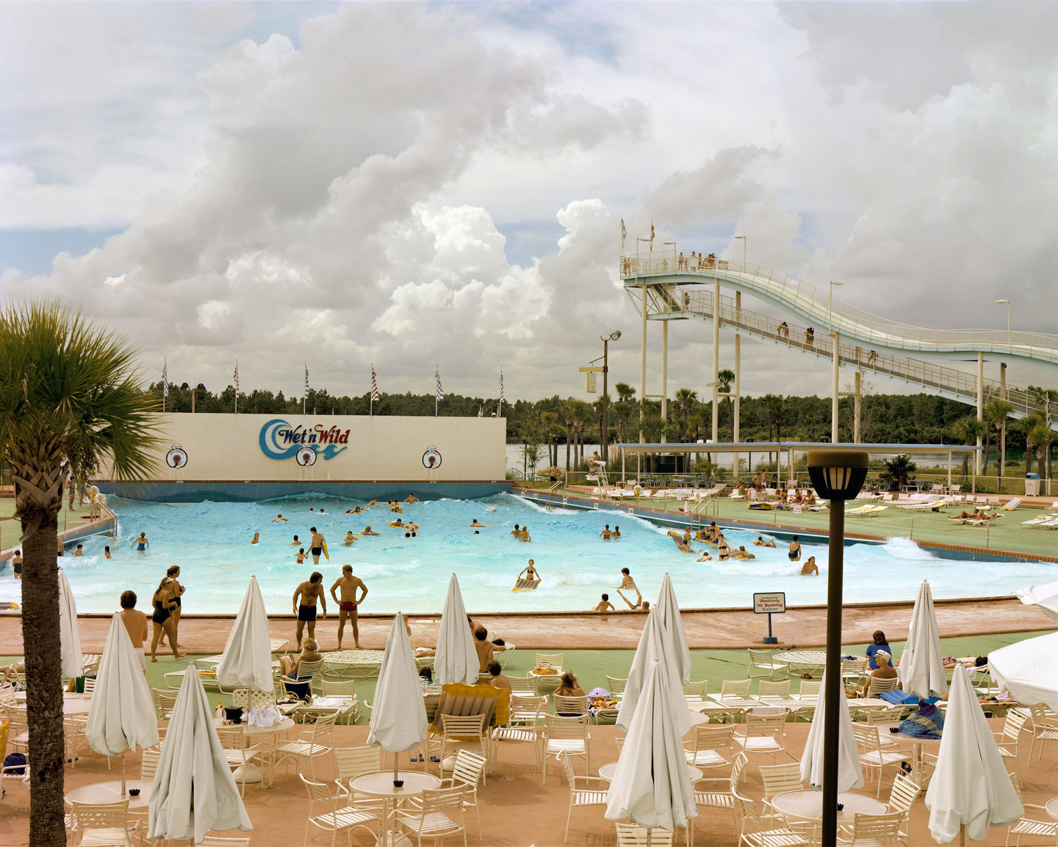
A romantic vein has been a feature of the New Colour movement, as part of its reaction to both the long history of monochromatic imagery in photography and minimalism in art generally during the late 1960s and early 1970s. This tendency is apparent in the work of Joe Maloney, who has used film balanced for artificial light in daylight to increase the intensity of his blue/green hues; and in that of Mitch Epstein, noted for his lush updating of travel photography, in which he allows himself to express, in images of classic perfection, a sense of delighted wonderment (e.g. Pushkar camel fair, India, 1978).
The apogee of this approach has been the Cape Cod series by Joel Meyerowitz, a dramatic change of pace from his earlier colour street photography. In his Cape Cod work (he has called the series ‘Cape Light’), Meyerowitz has exploited the 8 x 10 inch view camera’s verisimilitude and capacity for formal control with a relaxed sense of the photographic possibilities of light and colour shifting over sea, sand, architecture and people.
With the partial exception of Neal Slavin, who works within accepted commercial conventions, all of the photographers so far discussed are straight photographers, in that their work does not rely on manipulation of the subject or the photograph during or after printing to any marked degree. As the 1970s progressed a tendency developed towards such manipulation, encouraged by photo-documentation work produced by conceptual and performance artists, including some working in colour but whose work lies beyond the scope of this exhibition.
Artists influenced by this direction include Richard Misrach, John Divola and Jan Groover. Of these Misrach’s sources are the most purely photographic. His flash gives the fronds and boughs in his Hawaiian images the quality of a graphic, chancy gestalt, the apparent simplicity of his technique reminding one of the front approach of Diane Arbus’ photographs of society’s deviates in the 1960s, and behind that the everyday apparitions of the newspaper crime or society photographer. The colour in his work adds an edge of slightly repugnant authenticity to the greenery, and beauty to the skies.
An even stronger dichotomy is apparent in Divola’s ‘Zuma’ photographs, the pinks and creams of the beach and sky playing against the jagged forms of an abandoned house and the stark patterns of the marks he has embellished it with. These marks recall the grids and hidden romanticism of much abstract painting, but even more the aggressive graffiti found in the modern city. Set against a lyrical sea and sky, the house suggests the fragility of human civilisation.
Of all the photographers in this exhibition, Jan Groover was closest to conceptualism in the mid-1970s, and she drew the most on non-photographic conventions. Groover gained a reputation in the mid-1970s for multi-component, conceptual colour works, reconstructing the visual data of street scenes. From 1977 she began constructing still-lifes in her studio, leading to the arrangement of knives, forks, peppers and plants seen here. The use of colour superficially seems as selectively calculating as that advocated in instruction books for amateurs, yet it adds an ambiguous seductiveness to the cold glitter of her complex, active compositions. Her work displays a New York feeling for scale and boldness found, for example, in the paintings of Audrey Flack. It also demonstrates, like the photographs of Man Ray or Paul Outerbridge in the 1920s, a discipline of imagery and a sense of spatial play derived from Cubism.
Eauclaire had echoed Szarkowski’s notions that dismissed work made before the late 1960s as being unrefined and lacking sensitivity. It was this exhibition that has since been seen by many as a clear signal that colour photography can be considered contemporary art. The project included approximately fifty photographers some of whom had appeared following Eggleston’s landmark exhibition but fell into relative obscurity soon after. Eauclaire later followed with two more publications: New Color New Work (1984) and American Independents (1987).
Writing in 1985, photographer Lewis Baltz identified colour photography, along with the “New Topographics” exhibition of 1975 as the two photographic trends of the 1970s. Baltz recognised the work of Eggleston and Shore as representative of a committed effort to understand colour but he also went on to damn other bodies of colour work as “soft contemporary, user-friendly pap”. By the mid 1980s, however, colour photography had become a standard for art photography. From then on the designation “colour” was generally dropped from exhibition and publication titles. It had assimilated to the point that the distinction was no longer required. The importance of photographic practice gave way to modern theory and critical debate.
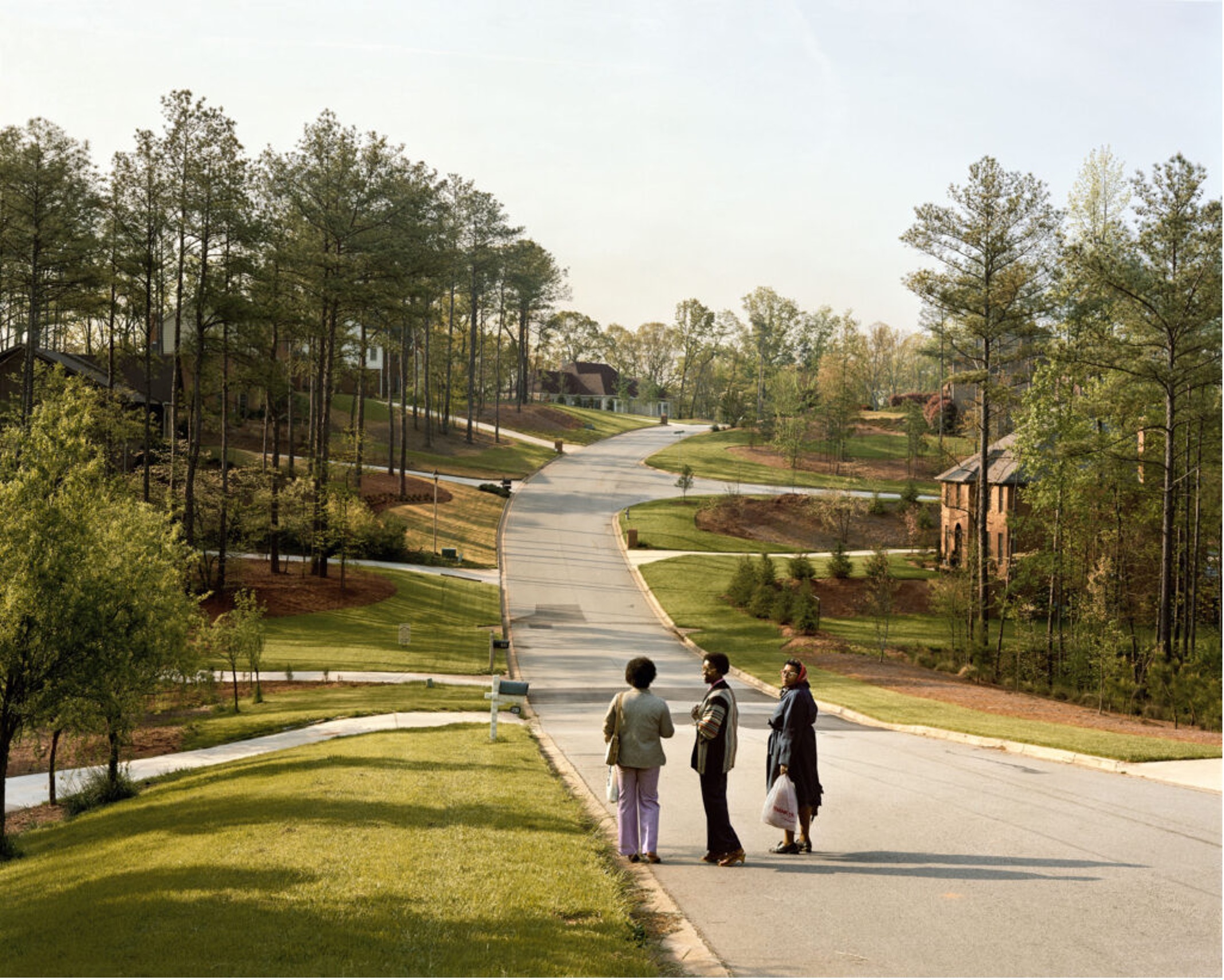 Joel Sternfeld (1983)
Digital Era
With the arrival of the first digital camera in 1975, it was clear that a revolutionary shift in imaging technology was on the horizon. Steven Sasson, an engineer at Eastman Kodak, used a CCD digital image sensor previously invented by George Smith and Willard Boyle as the backbone of the 3.6kg (8 pounds) device, which nevertheless captured black and white images to a cassette tape in approximately 23 seconds of exposure. That same year, Bryce Bayer invented the Bayer Color Filter Array, which enabled a single CCD or CMOS image sensor to capture colourful images; without it, registering colors would require three separate sensors attached to a beam splitter, which would be both large and expensive. The Bayer filter is used in almost every digital camera made today as well. Throughout the 1980s, many camera manufacturers like Konica, Leica, Sony, Pentax, Fuji, Nikon, Canon and of course Kodak all began introducing smaller and compact cameras with more and more advanced sensors, lenses and memory/storage for a wider use, eventually leading towards today’s most developed cameras and mobile phone lenses.
The great attraction of contemporary photography as an object for museums and collectors is closely connected to the reemergence of the panel painting. This is not only articulated through the increasingly large formats, but also in the expense of pictures that are very complicated to make. Even in the pre-digital era, Canadian artist Jeff Wall (1946-) pushed the genre of the staged photograph to the limits with his large transparencies shown inside illuminated display cases. Wall’s theme is definitely reality itself, but compared to photographers like Shore and Eggleston, he does not simply want to take pictures, but to depict images. Andreas Gursky represents a similar point of view, saying in an interview, “The only way to depict reality is to construct it.” In the age of unlimited possibilities offered by digital photo processing, it might seem paradoxical that photography seems to be returning to the classic compositional techniques of painting, as well as to a conservative concept of art.
Gursky’s tableaux, in particular, might easily be accused of giving into the traditional perspective of the museum visitor, while their classic composition invites quick consumption. At first glance, from a distance, his landscapes, architectural pictures, interiors, and crowd scenes seem to harmonic, balanced compositions with a single perspective. As a matter of fact, however, there is no focus; each motif is subtly positioned and meticulously worked out. Each and every time the viewer gets closer and more intently involved, he stumbles into an infinitely complex world of motifs, relationships, and perspectives. By reflecting the relationship between reproduction and authenticity, Gursky’s photographs remain true to one of the great aesthetic leitmotifs of photography, whose artistic potential has in no way been exhausted, despite the flood of images produced in the digital age.