The 1930s was the decade when the autochrome and all other screen processes on glass became obsolete as various tricolour printing processes were finally commercialised for those who could afford to use these services. Tricolour negatives could be routinely, if expensively, sent to the lab for reliable processing and printing, rather than be painstakingly tackled at home by the photographer.
Black and white had long been the medium associated with both art photography and serious photojournalism, “black and white are the colours of photography” Robert Frank famously declared. Colour was available to regular consumers in the early years - notably Charles W. Cushman shot over 14,400 Kodachrome slides from 1938 to his death in 1972 - but it was slow (ISO 10), expensive (60USD a roll, adjusted for inflation) and positive transparencies (slides) were hard to replicate.
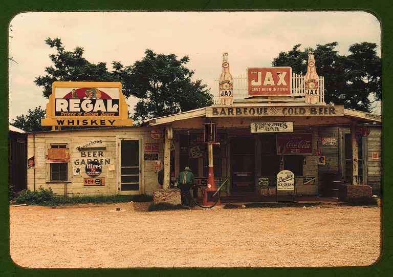
 Charles W. Cushman (1938)
The push for colour in the 1930s was stimulated by three different industries, all of which were growing exponentially: the film industry, the advertising industry; and a growing ’lifestyle’ industry and news publishing industry which fed off the previous two. Photographic research and processes were largely geared to meet the demands of the commercial cinema, which was starting to look more seriously towards colour. Technicolor motion pictures like Gone with the Wind (1939) and The Wizard of Oz (1939) built a public appetite for colour. This in turn lead to increased demand from the amateur market for home colour systems, which initially took the form of 16mm film for home movies and later 35mm slide film for photography.
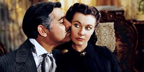 Gone with the Wind (1939)
The most influential use of colour, however, was in the advertising industary. Whilst colour advertisements had already been around for decades, it was mostly added by hand. A new wave of ’lifestyle’ magazines found exponential growth when they used colour in their editorial and advertising pages.
Madame Yvonne enthusiastically embraced colour into her editorial and advertising work almost immediately and in 1937 had two colour images from her photo-essay on the Queen Mary ocean liner exhibited at the Museum of Modern Art, in Beaumont Newhall’s seminal exhibition “Photography 1839-1937”. Also on display was colour work by Nickolas Murray, Edward Steichen and Paul Outerbridge.
Some of the most provoking colour photography of the 1930s was that by artists who were often self-taught photographers and unafraid to mix mediums in their work - sometimes incorporating paint, pencil, sculpture and collage. Their output showed that colour could be employed as an innovative form of expression, aligned with progressive Modernism and Surrealism. May Ray and László Moholy-Nagy were both important members of the new avant-garde intrigued as to whether colour in photography could create a new kind of visual language, outside of its heightened ability to document the world.
 László Moholy-Nagy (1937–1938)
Moholy-Nagy experimented with unrealized possibilities in photography producing photograms (camera-less photographs), negative prints, collages and montages. His interests in pattern and light, transparency, reflection and distortion are all apparent in his still-life work.
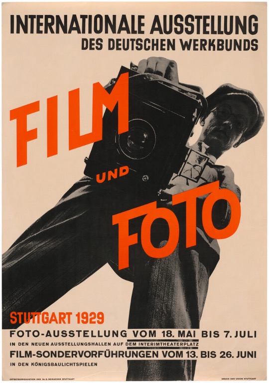 Film und Foto (1929)
The “Film und Foto” exhibition held in Stuttgart in 1929 was the ultimate showcase of a New Vision in photography and film. Among those whose work was exhibited, including Edward Steichen, Paul Outerbridge, Man Ray and Moholoy-Nagy, was Willy Zielke (1902-89) - who was known for carefully composed Modernist still-lifes of everyday objects, made using various techniques including tricolour Carbro. As war approached, many German and Eastern European practitioners moved elsewhere in Europe and to America and the New Vision was gradually absorbed into the international mainstream.
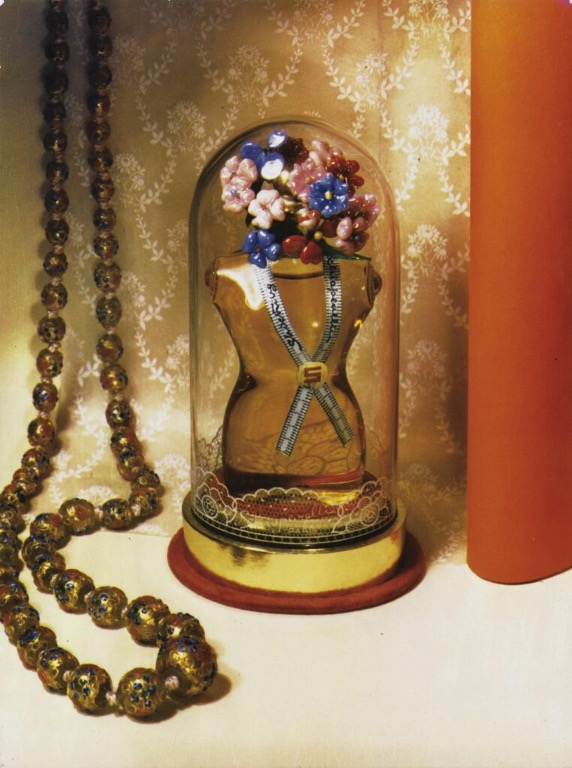 Willy Zielke (1937)
In 1939, Werner Bischof was gifted a Devin Tricolor Camera by Conzett & Huber, the Swiss printers of Du magazine who were keen to show off their new colour printing capability. As a Tricolor camera, it shot three black-and-white glass negatives simultaneously through separate R/G/B filters. Back in the darkroom you would again utilize filters to layer the negatives and achieve a colour photo. A process that yielded good colour in the studio, but not suitable for the street. Against a backdrop of war that raged around Switzerland, Bischof spent years experimenting with the camera whilst making a living with fashion and advertising photography. When the war ended he left the relative comfort of Switzerland with his Devin to photograph the destruction and chaos of post-war Europe. In 1949 he became the first new member of the Magnum Photo Agency, after the original founding members.
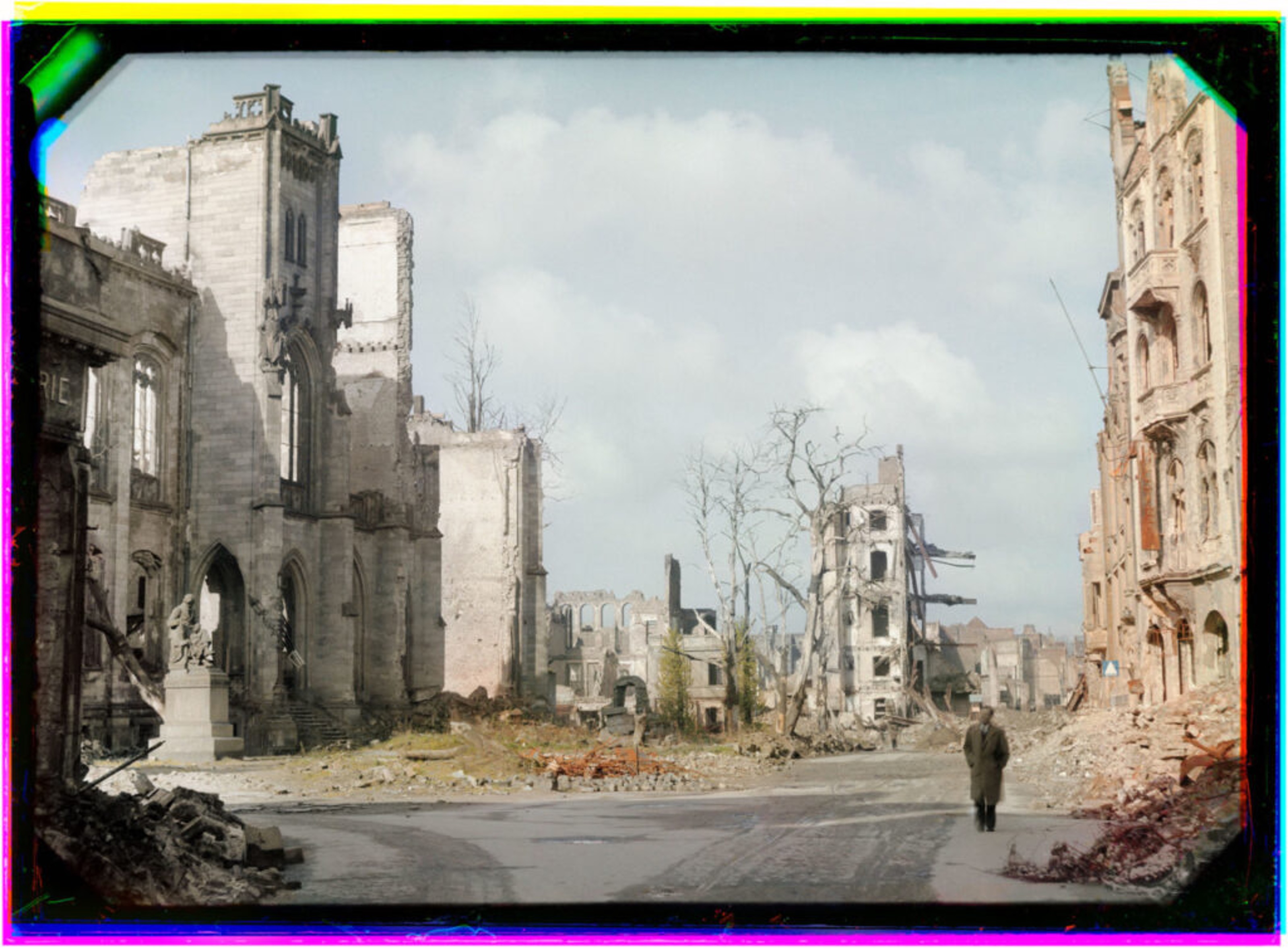 Cologne, Germany, Werner Bischof (1946)
Robert Capa experimented with Kodachrome as early as 1938, when he used at least one roll on the burning of Hankou, China in the wake of Japanese raids on 19th July 1938. Life published four of these colour images in the 17th October issue. Only a week after this first roll Capa is said to have requested a dozen more to be sent to him in China, but no additional images have ever been identified or published. Nonetheless, he demonstrated a clear enthusiasm for colour at an early stage and went on to use it regularly from about 1941 until his death in 1954, with a brief hiatus in the period 1943-47 perhaps owing to a lack of availability. Such was his enthusiasm that the ICP (International Centre for Photography) holds more than 4,000 colour Capa transparencies of varying formats — 35mm, square format, even 4×5 sheet film. He liked to carry at least two cameras around his neck at all times and often shot both - being well aware that magazines would pay more for colour. His Kodachrome images of allied soldiers in World War 2 are reminiscent of the work done by the Office of War Information during the same period. Aside from their similar substance and form, they all remained virtually unknown to the outside world until only recently.
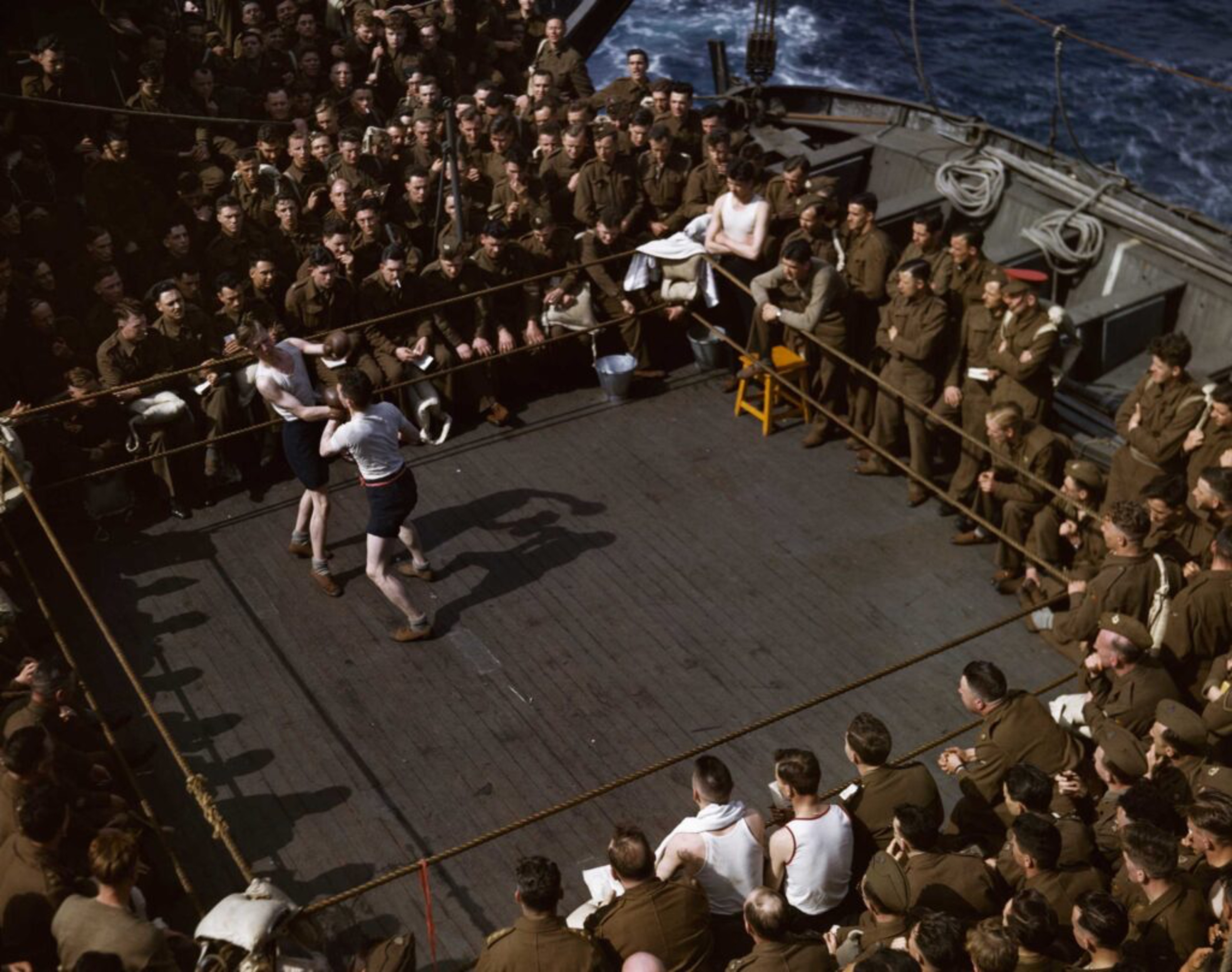 Robert Capa (1943)
The Farm Security Administration (later the Office of War Information during World War II) 1935-44 provides one of the earliest examples of modern documentary photography with an archive of 175,000 photographs, however across both the FSA and OWI, only 1,600 images are in colour (https://www.loc.gov/pictures/collection/fsa/). Nonetheless it provides one of the first and historically most significant bodies of work to be photographed on Kodachrome. The project was run by Roy Emerson Stryker (1893-1975), head of the Information Division, who deployed a team of more than 20 photographers to document the “spirit of America at a time of great trial.”
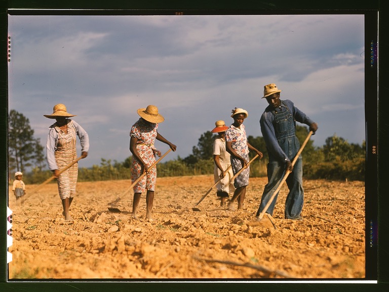
The 644 colour photographs produced by the FSA are less well known and far less extensive than the unit’s black-and-white photographs. Most of the colour images are 35mm Kodachrome slides; a few are colour transparencies in sizes up to 4x5-inches. The FSA colour photographs depict life in the United States, including Puerto Rico and the Virgin Islands, with a focus on rural areas and farm labour.
 Marion Post Wolcott (1940)
Most of this colour work remained hidden in the Library of Congress archives until discovered by Sally Stein through the course of her research. The colour images were not widely known and rarely reproduced at the time owing to the difficulty and expense of using them in newsprint, which could not yet reproduce colour to the same extent as the new illustrated magazines. Nonetheless, the archive offers a small but important window into American life prior to World War II.
America during the depression era was one of stark contrasts, with a colourful consumer-led boom in many urban areas set against a backdrop of abject poverty in the most rural communities. Photojournalism had been shaped by the first World War and its aftermath, with a focus on portraying a world stripped of joy and filled with hardship, the struggle for survival, hunger, and disease. Whilst the commercial industry had turned to colour photography to reflect abundance and choice, to portray rural communities in the same light would have been akin to commercialising poverty. Scenes of poverty, displacement, hunger and disease were more firmly reinforced by stripped down, stark black-and-white images. The medium echoed the message.
 Jack Delano (1941)
Documentary photographers saw colour as another tool of corporate greed rather than a means of thoughtful expression and to some extent these feelings were also mirrored in the political arena. Those opposed to “New Deal” programs were wary of the work being done by the Stryker’s team and viewed it as an effort to create propaganda with taxpayer dollars. The use of colour methods in printing early FSA reports was seen as excessively showy, even when it was limited to a few illustrations. Government publications of this period were typically text heavy, black and white documents laden with names and numbers. Stryker’s attempts to provide visual support to the documents was notable, and at times aroused suspicion among political enemies of New Deal policies. Early in the FSA history Senator Arthur Vandenburg of Michigan, an opponent of most relief programs referred to the first FSA report as “a triumph in typography, with all its magnificent colour work and all its artistic maps and illustrations. In fact, I have never seen finer salesmanship or propaganda in all my life." This theme was echoed in newspapers of the day, with the Washington Post weighing in that “trick typography and splashing colours have no place in public reports.” Add to this the increased cost of colour printing, it was viewed as an extravagant process used to trick the public to buy into government policy, in the same way advertisers used colour.
 John Vachon (1942)
Whilst FSA imagery was primarily used for news and periodicals, Stryker found a market for the work in the art world. He launched an exhibit that placed seventy black and white FSA photos as a group essay in Grand Central Station in 1938. The displays were so popular, the Museum of Modern Art circulated the display as a traveling exhibit. Exhibition in galleries required museum quality reproductions and oversized prints, items that were not technically perfected until the early 1940s. Making large format colour display prints from colour transparencies was simply not possible during the 1930s, so colour photographs could not go on display in these venues. Given the great deal of prejudice that already existed in the art world with regard to colour photography, this was not the project with which to try and tackle those preconceptions. Stryker capitalised on an emerging public fascination with Kodachrome to some extent by including some colour photographs in his slideshows, however the transient nature of these presentations meant they were relatively infrequent and poorly publicised.
Stryker himself was aware of how technically complex colour printing may limit the reach of their work and how the associated connotations of colour could be perceived in stark contrast to their stated objective. He was not, however, overtly opposed to the use of colour photography in principle leading some FSA photographers (notably Russell Lee, Jack Delano and Marion Post Wolcott) to shoot Kodachrome alongside their black and white work. Nevertheless, Stryker was unable to succeed in ever having a colour FSA photograph published, and the colour work sat undisturbed in an archive for nearly 40 years.
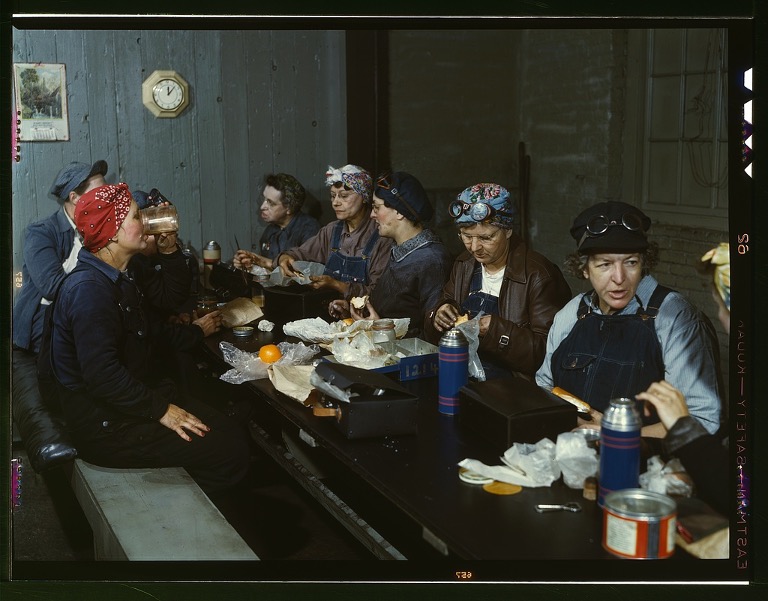
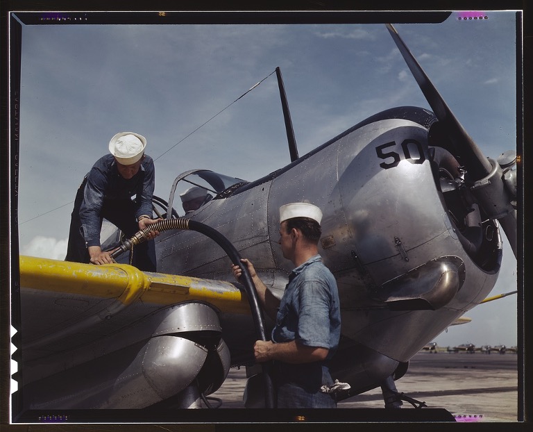 Howard R Hollem (1942)
The FSA evolved in 1941 into the Office of War information, whose mission was to document the efforts of Americans as they prepared for and sustained the war effort on the homefront.
The 965 colour photographs from the OWI are colour transparencies in sizes up to 4x5-inches. The photographs depicted life and culture in the U.S., with a focus on factories and women employees, railroads, aviation training, and other aspects of World War II mobilization. Just as Stryker had been adept at selling Americans on the New Deal by highlighting the need for relief, he became adept at selling Americans on the need to protect a way of life by projecting the virtues of American society and an image of power throughout the world. In many ways, the virtues being sold were the opposite of the gloomy message of the FSA, and colour photography lent itself well to the task of keeping the country unified during wartime. Colour images of this period were made to reflect the continued richness of life American communities, despite the war, and projected a sense of technical and material superiority.
 Jack Delano (1943)
Across the Atlantic, those in the UK had to be content with recording World War II in monochrome or with the softer and technically inferior Dufaycolor. Whilst Kodachrome was available in Britain during the war, it was hard to find. Some of the most striking colour images of Britain at war were taken by John Wilfrid Hinde (1916-97), who had been commissioned by the Ministry of Information on a project entitled “Citizens in War - and After”. These images captured the lives of the Civil Defence Forces and ordinary civilians, following the action closely with assistance from the Home Office. He later became known for his meticulously planned shoots, creating idealised and nostalgic postcards which he turned into a successful business, hiring Elmar Ludwig, Edmund Nägele and David Noble to support him.
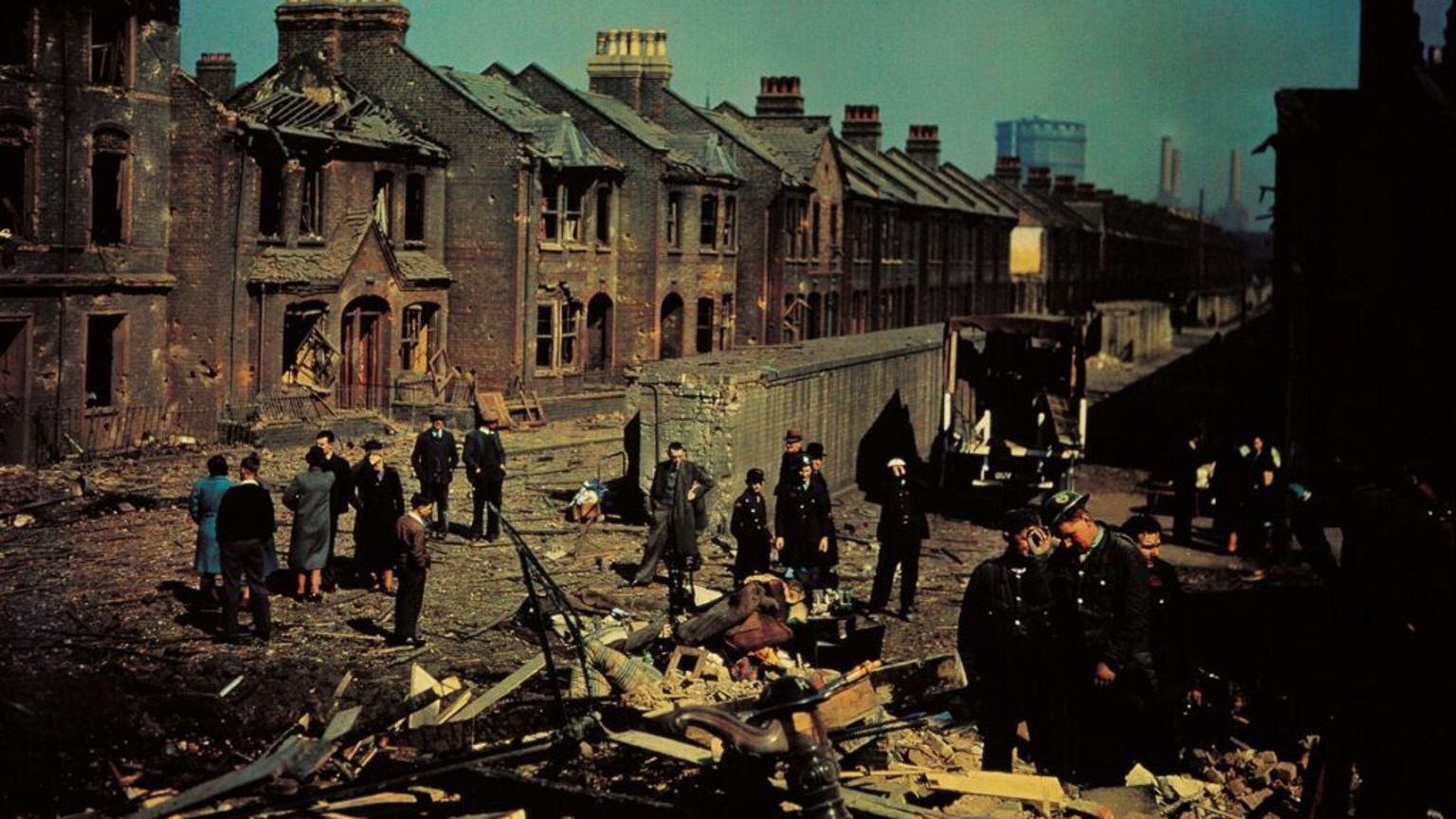 London in Dufaycolor, Photographer Unknown (1943)
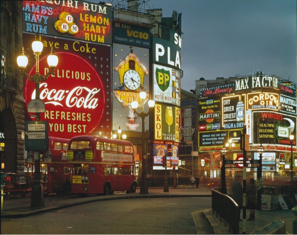 Elmar Ludwig (1965)
Whilst Europe adjusted to postwar life, which was mostly captured in monochrome, the American advertising industry continued to leap forward. The perfection and distribution of colour processes only accelerated after World War II and the medium moved further away from the studio - into the pockets of consumers and onto the road, supported by the proliferation of new 35mm cameras. Product research accelerated as manufactuerers recognised that there was money to be made from user-friendly colour processes.
In 1939 had Kodak started to return film to customers in the form of cardboard mounted slides. Consumers were saved the laborious process of cutting and mounting themselves and their photographs could be enjoyed as soon as they were received - recapturing the sort of convenience that Kodak was built on. Kodak went on to produce their first colour negative film ‘Kodacolor’ in 1942 which was marketed as “the world’s first true colour negative film”. More accurately, it was the first colour negative film intended for making paper prints: in 1939, Agfa had introduced a 35mm Agfacolor negative film for use by the German motion picture industry - here the negative was used only for making positive projection prints on 35mm film, although their line of products was not widely available outside of Germany until after World War II. In 1946, Kodak followed up with Ektachrome, which was the first colour film that could be developed by the photographer rather than returned to the factory for processing.
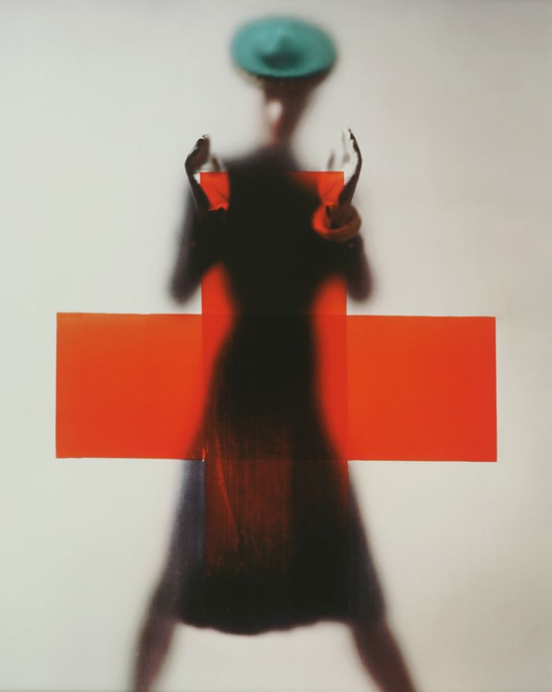 Erwin Blumenfeld (1945)
Erwin Blumenfeld, a successful fashion photographer, was by this time one of the most active in promoting colour photography, seeing the benefit of incorporating the medium into his work as Laszlo Moholy-Nagy did. Harry Callahan became interested in colour in 1941 and Arthur Siegel in 1946, appointed by Moholy-Nagy to teach “New Visions in Photography” at the Institute of Design in Chicago where they were now all working. Magnum Photos Agency was founded in 1947 and the following year one of its co-founders, George Rodger, organized a trip that enabled him to escape the chaos of post-war Europe and pursue his personal photographic practice. With his new found freedom from magazine assignments, he embarked on a journey through Africa - traveling over 28,000 miles from Johannesburg to the Mediterranean. In southern Sudan he became the first Westerner officially permitted to photograph the peoples of the Nuba mountains. Rodger meticulously recorded their lives through detailed texts and both colour and black and white images.
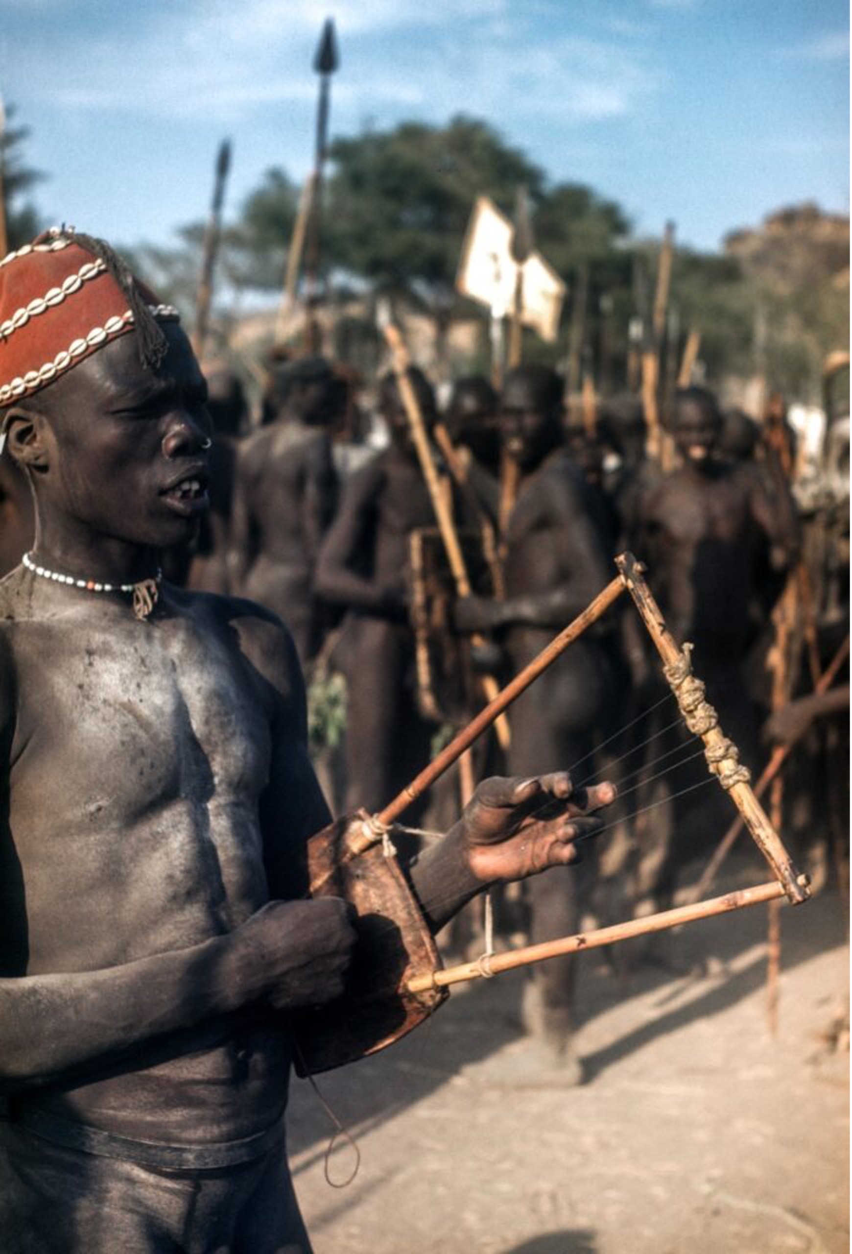 George Rodger (1949)
Colour photographs began appearing at MoMa with more frequency in the 1940s. Eliot Porter (1901-90) had been shown there in 1943. Not since the Autochrome was marketed in 1907 had colour photography been used so successfully to capture the natural world as it was by Eliot Porter. He began to use colour film in 1939 to achieve a more accurate record of birds, but found the results so rewarding that he used it in all his nature and landscape photography. Porter’s books, many published by the influential conservation group the Sierra Club, used his evocative colour photographs to spread the message of environmental and ecological awreness. Porter’s colour photography, with its outstanding harmonious and lyrical qualities, gave nature a sense of calm familiarity and in the process he produced pieces of abstract art.
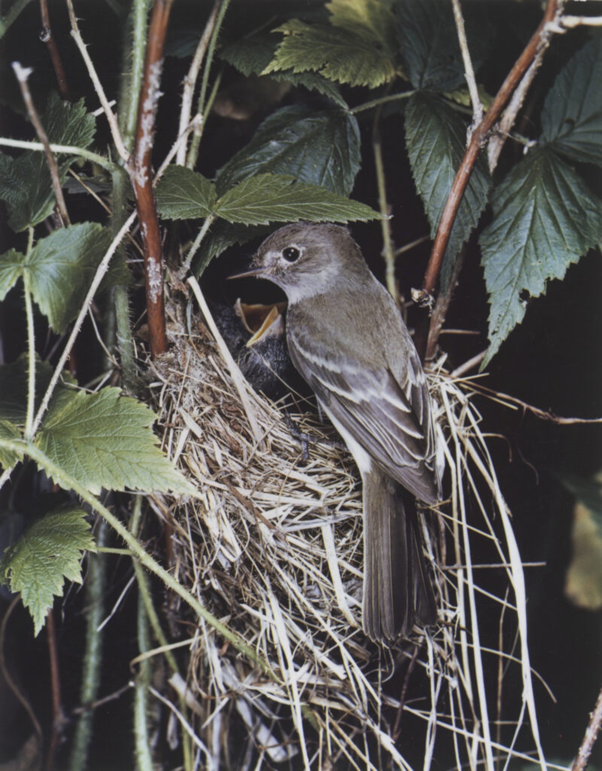 Eliot Porter (1940)
When Edward Steichen joined MoMa as their second ever Director of Photography (1948-62) he explored colour work in several large scale exhibitions. He brought a populist attitude to his role and his exhibitions included press photography and other forms of commercial work alongside art photography. Steichen’s first proper show at the museum, In and Out of Focus, a broad survey of contemporary trends in photography, opened in 1948 and included what one reviewer called “garishly blown up experiments in colour photography” by Weston, Ansel Adams and several others. Two years later, Stichen organised “Color Photography”, a massive show consisting of 342 photographs by 75 photographers which included work by Harry Callahan, Eliot Porter and other art photographers, showcasing a range of subject matter and styles that reached beyond artistic photography, mixing examples of industrial, governmental, journalistic and amateur photography. The show was designed to be progressive and help integrate the medium, but unfortunately only emphasised the commonly held believe that colour was a commercial and amateur medium. Steichen’s subsequent show featuring colour “Abstractions in Photography” (1951) fared little better. The museum had also exhibited some of Saul Leiter’s colour photography at in 1953 at “Always the Young Strangers”, however his work remained virtually unknown to the world thereafter. Leiter would remain employed by Henry Wolf, art director of Esquire magazine, and for the next 20 years, working as a fashion photographer for Esquire, Harper’s Bazaar and others.
The group exhibition had mixed colour, black-and-white prints and transparencies. He included five black-and-white photographs by Saul Leiter ‘of a surrealist nature’. Leiter switched from black and white to colour in 1948, using it to find a delicate urban romance in the gritty, hectic streets of New York. Leiter coaxed soft, muted reassuring colours form out-of-date film stock, or used cheaper, more unpredictable film from obscure companies to create his on colour palette. His unique palette, intriguing compositional graphics and fearless use of dissecting planes of colour echo in photographic form the Abstract Expressionism of painters Mark Rothko, Barnett Newman and Richard Pousette-Dart.
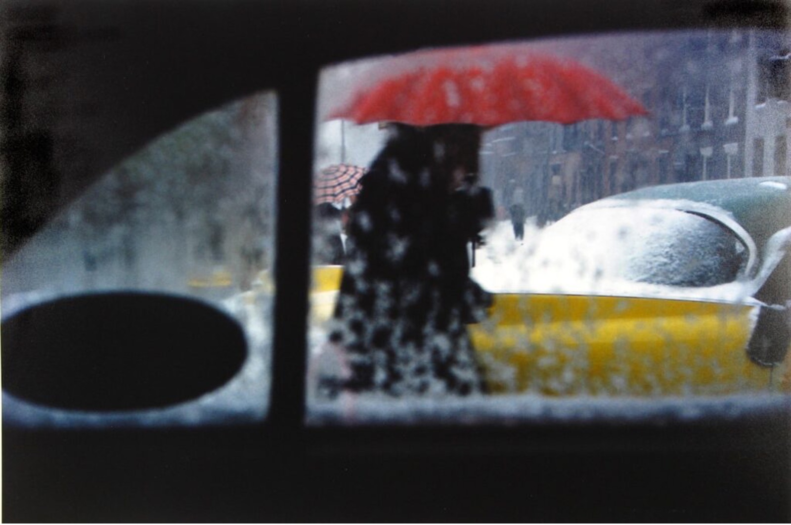 Saul Leiter (1955)
Conde Nast Publications (publisher or Vogue, Vanity Fair and House & Garden) had by this point already established themselves in lifestyle publishing and had employed some of the foremost photographers of the day, such as Baron de Meyer, Edward Steichen and Man Ray, giving them a fair amount of freedom to run with their own artistic vision. Under Alexander Liberman however the rate of innovation increased significantly as he moved away from the old formal, staged and artificial fashion shots and introduced a whole new breed of photographers (Richard Avedon, Erwin Blumenfeld, Clifford Coffin, William Klein, Herbert Mattar, Gjon Mili, Norman Parkinson, Irving Penn and John Rawlings) - all encouraged to think outside of the box and use colour photography to give the titles a bold, modern look. These photographers replaced formalism with Abstraction, Surrealism, Minimalism, Naturalism and Modernism and found new ways to capture images, experimenting with lighting location, backdrops, lenses, cameras and films. The palette of colours they used came to help define the era.
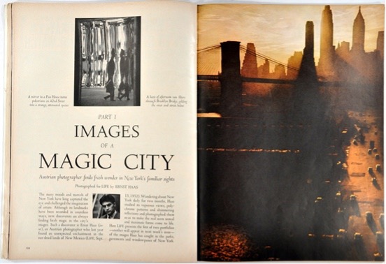
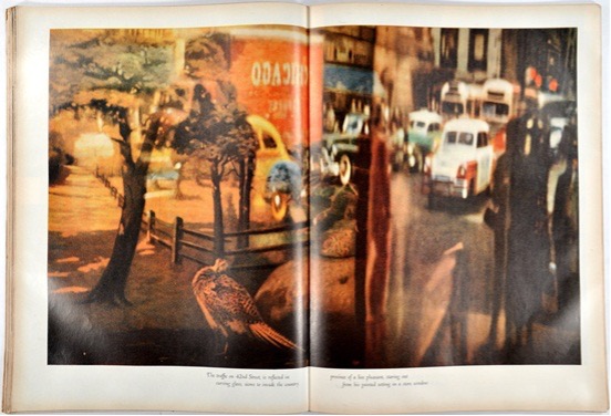
Life magazine also joined the race for colour, publishing their biggest colour spreads yet in 1953 - a two part photo-essay featuring colour photographs of New York entitled “Images of a Magic City”. It had commissioned the talented young Austrian Ernst Haas who had arrived in the USA only two years previously, escaping war-torn Austria. After declining a full-time role from Life and joining Magnum, choices he made to retain his freedom over commissioned assignments, he spent the next 30 years working across a wide variety of publications. By 1958 he had already been voted as one of the best photographers in the world by Popular Photography magazine.
 Ernst Haas in Life, 1953
 Ernst Haas in Life, 1953
The 1950s was the time when colour photography began to come out of the woodwork as it became cheaper as well as quicker and easier to work with. Its proliferation in the illustrated press, the cinema, advertising and fashion made it an increasingly familiar part of people’s daily lives and one with which they became progressively more comfortable.
Kodak spent the 1950s lavishing its colour films on well known photographers like Edward Weston and Ansel Adams but little came of it. The photographers used the products and even half-heartedly shilled for them, but nothing could counter their belief that colour photography was the crude instrument of commerce and advertising. Notably, Adams accepted a commission to shoot Kodachrome of pristine western views as part of Standard Oil’s campaign to promote tourism and Weston photographed Point Lobos with Kodachrome before moving on to produce more images of his classic subjects, many of which appeared in Kodak advertisements for years after.
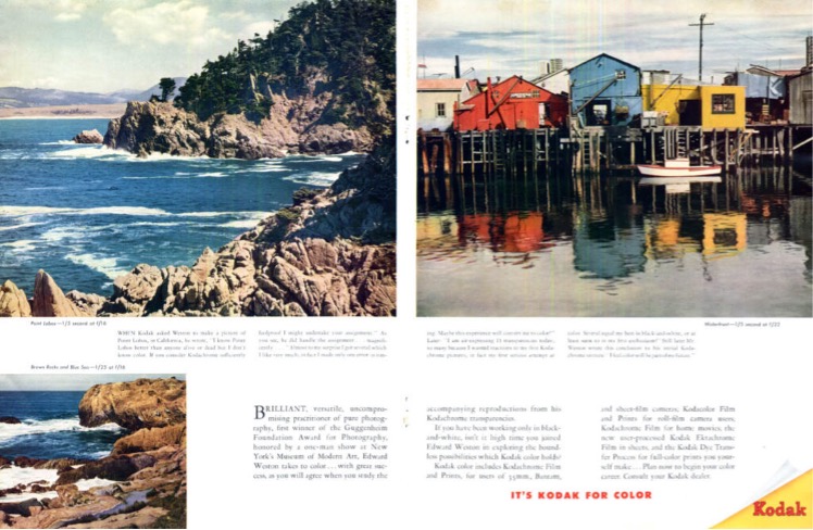 Edward Weston (1947)
Kodak had installed a large photographic display on the east balcony inside New York City’s Grand Central Terminal from 1950 to 1990. Across its life the “Colorama” screen displayed 565 images in total, capturing an idealised view of post-war American life and serving as advertisements for the Eastman Kodak Company. The photographs were backlit transparencies, 6m tall and 18m wide, described as “The World’s Largest Photographs” and changed every few weeks.
Magnum Photos continued to expand in the 1950s, adding a number of talented young photographers to its roster with some like Eve Arnold and Burt Glinn shooting colour on assignment. In 1953 Inge Morath and Elliott Erwitt both joined. Whilst best known for their iconic black and white photography, they shot a significant amount of colour throughout their time at the agency.
 Inge Morath (1954)
The photographic world had been changing throughout the 1950s. The illustrated press – which most photographers of serious artistic intent had relied to share their work and earn a living – was starting to lose momentum in favour of the television. Photographers were also beginning to mistrust publications which may distort or dilute work to fit a given editorial direction. As publications had matured, and their procedures more regular, it became increasingly difficult for even the most determined photographers to use the magazine as a vehicle for their personal views of the world. By publishing their own books they could control the image selection, sequence, scale and context. Robert Frank’s “The Americans” was a pinnacle of artistic integrity and independence – a fact confirmed by how difficult it was for Frank to find a publisher. Only a generation earlier, artists saw their work circulate in publications like Life, Look, Fortune, Esquire, Vogue and Harper’s Bazaar, but now artists were starting to look elsewhere – opportunities were emerging to create and manage their own narrative.
From the 1960s, photography was also starting to be studied as an art form, particularly in the United States. The scope and seriousness of this academic framework brought a larger audience to photography and provided greater opportunities for photographers to make a living outside of pure commercialism.
Ironically however, despite explosive growth in photographic education, traditional opportunities for photography were already in decline. Picture magazines saw weaker demand in favour of the television and many other forms of photography (portraiture, wedding pictures, scenic views, product photography, PR photos, architectural views, insurance-claim documents etc) saw weaker demand for a “professional” in favour of an amateur who could provide approximate and graceless images, but ones that were ultimately ‘adequate’ for their intended purpose. Szarkowski describes the shift as a move from a specialised craft (like stone carving) to becoming a universal system of notation (like writing). Despite the role of a photographer transitioning through the decade, one of the by-products of more formalised photographic education was the creation of a more appreciative audience. This ultimately contributed to the success of the many ground-breaking exhibitions that were held in the subsequent two decades – many of which used (at least some) colour photography to convey their message. Elsewhere more enthusiasts were also beginning to adopt colour to document their own lives, as colour film slowly became cheaper and more widely available. Kodak launched the Instamatic 126 camera in 1963 which - loaded with Kodacolor negative film - was cheap, easy to use and provided good results under a wide range of conditions. Polaroid also launched their first instant colour film called Polacolor, a peel apart negative/positive system that could be used in most existing Polaroid cameras.
Colour was also starting to expand into the regular news cycle, with the addition of weekly colour supplements - usually as part of a Sunday newspaper - which provided an avenue of work for photographers. The first British colour supplement was launched by The Sunday Times on 4th February 1962, and followed by the Observer on 6th September 1964.
In 1962 Ernst Haas was given a 10 year retrospective, Ernst Haas - Color Photography, at the Museum of Modern Art (MoMa) having already bridged the gap with colour photography for use in both photojournalism and as a creative, expressive medium. However critics and curators had come to regard Haas’s pictures as “too easily accessible” and not sufficiently “serious” to hold his work in high esteem. This criticism had a lasting impact, meaning his reputation suffered in comparison to some of the younger photographers in the history of colour photography. The MoMa exhibition was set up by John Szarkowski but had been one of the last exhibitions planned by his predecessor Edward Stiechen. In March 1963, Szarkowski organised a one-night exhibition, Three Photographers in Color, including the work of William Garnett (1916-2006), Helen Levitt (1913-2009) and Roman Vishniac (1897-1990).
Paul Outerbridge once wrote that still life offered the greatest possibilities “for purely creative work in color photography” and it was Marie Cosindas who, from 1962, demonstrated it best. After being invited by Dr. Edwin Land and the Polaroid Corporation to test their new instant-developing colour film she began to work exclusively in colour, manipulating various components of the process to produce the warm tones she preferred. Cosindas found that using Polaroid freed her from all the technicalities involved in making colour prints, and she was able to concentrate just on her images. Using only available light and often having only a few minutes in which to photograph her subjects, Cosindas produced a remarkably distinct portfolio of portraits of well-known figures. In addition to her portraits, Cosindas created evocative still life images incorporating flowers, fruits and vegetables, textiles, jewelry, trinkets, and other objects Cosindas carefully arranged then photographed. In 1966 her images were shown at The Museum of Modern Art, with Marie Cosindas: Polaroid Color Photographs, becoming the first exhibition to be devoted entirely to Instant photography.
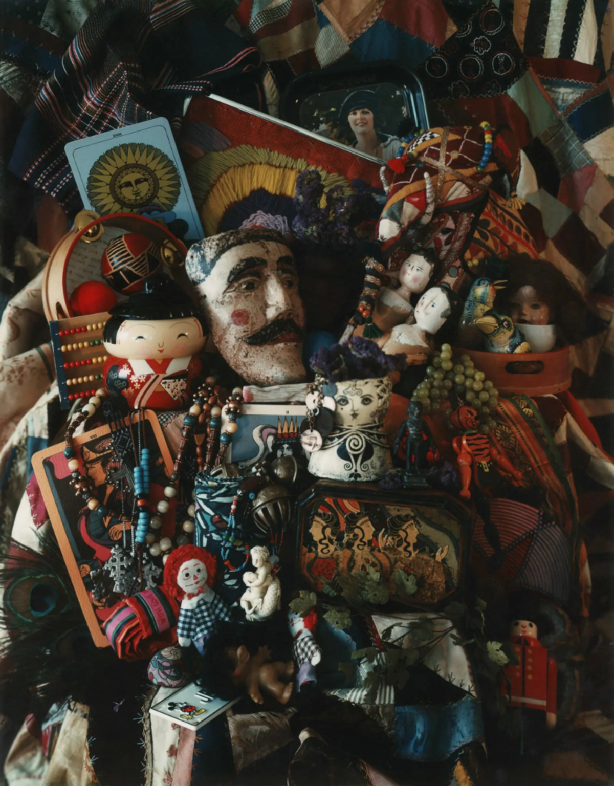 Marie Cosindas (1976)
“Among the twenty of thirty outstanding photographers working in 1960, it is likely that only two – Eliot Porter and Ernst Haas – would have said that their most important pictures were in color” Szarkowski hypothesises in Mirrors and Windows. “For most photographers, colour was something of an embarrassment – a commercial blessing and an artistic mystery” he continues. Whilst black and white was still generally associated as the medium for both art photography and serious photojournalism, by the 1960s these photographic tracks had drawn closer together, with museum collections and exhibitions often intentionally blurring boundaries between the two.
 Tony Ray-Jones (1963)
During the 1970s, a number of American photographers turned increasingly to colour – many making the switching permanently. Tony Ray-Jones (1941-72) was a British photographer who began working in black and white in the 1960s, moving briefly into colour before tragically passing from leukaemia. From studying and working in America he had returned to Britain in 1966 to document life there but was ultimately disappointed by the British lack of interest in non-commercial photography, compared with its growing appreciation in the USA. “Photography to me is an exciting and personal way of reacting to and commenting on one’s environment and I feel that is perhaps a great pity that people don’t consider it as a medium of self-expression instead of selling themselves to the commercial world of journalism and advertising.” Ray-Jones found an outlet for some of his colour work in The Sunday Times supplement but was ultimately so frustrated by his attempts to get work published in Britain that he moved back to America, intending to work on several more colour projects and segway into cinematography.
Things were slowly changing for photography in Britain in the early 1970s. Bill Jay was appointed Director of Photography at the Institute of Contemporary Arts (ICA) in 1970. Sue Davies, previously of the ICA, founded The Photographer’s Gallery in 1971 and Barry Lane was appointed the first photography officer at the Arts Council in 1973 with a brief to fund photography exhibitions and publications. The first major photography auction was also held at Sotheby’s in London in 1971 and the number of photography collectors and dealers began to accelerate sharply. As photographs started to attract greater monetary value, the number of commercial photography galleries also began to increase.
In terms of accessibility, the emerging importance of instant polaroid photography cannot be understated. Launched in 1972, the Polaroid SX-70 was unlike the previous peel apart negative/positive Polaroid processes in that it used an absolute one-step integral system, whereby a grey positive image was ejected after two seconds and developed into full, bright colour in ordinary light. One surprising advocate of this camera was Walker Evans, who had spent the majority of his career dismissing colour as “vuglar”. Following the death of Edward Steichen (1973) and with his own health starting the fail, Evans used the SX-70 intensely before passing away himself in 1975. He became enamoured with its direct and intimate abilities and its self containment that made the darkroom redundant – something we take for granted these days. With seemingly unlimited film donated by Polaroid, he produced ~2,500 images focusing on quintessential American subjects; small town facades, architecture, weathered signs and typography.
Evans influence can be clearly seen in the work of photographers throughout this period, especially in William Christenberry and Stephen Shore. Their works illustrates the increasing desire of photographers to use colour to shun conventional subjective themes and concentrate on less traditional subject matter.
 William Christenberry (1971)
Christenberry, who initially used photographs as aides-memories for his paintings, was encouraged personally by Evans and set about documenting the ravages of time on rural structures. The work he initially showed Evans was made using a Kodak Brownie box camera, but he soon moved onto 35mm Kodachrome, before adopting 8×10 in 1977 at the suggestion of Lee Friedlander.
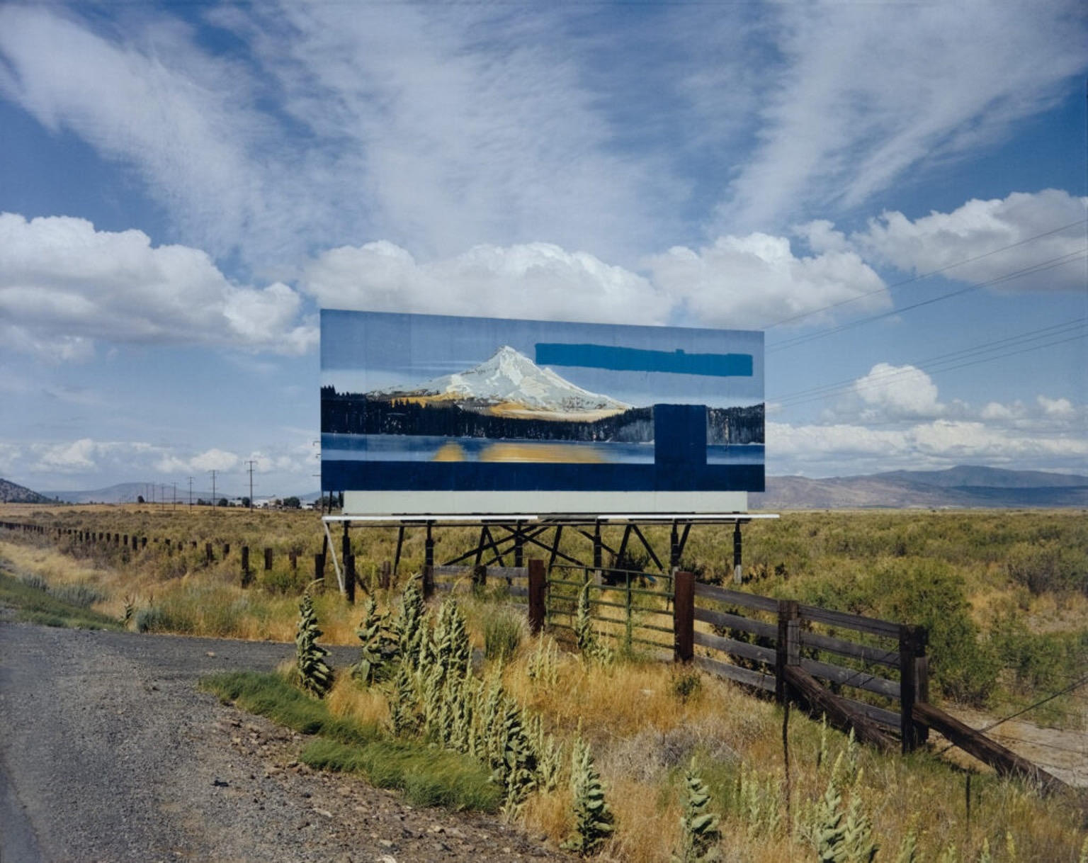 Stephen Shore (1973)
Stephen Shore had exhibited individually at the Metropolitan Museum of Art in 1971 (the first solo show by a living photographer at the Met since Alfred Stieglitz, 40 years earlier) and made many road trips in USA and Canada photographing in colour – first on 35mm, then on 4×5, and finally also adopting 8×10. His photographs are formally composed and offer insights the urban sprawl of American landscape. His work was also included in the group show “New Topographics: Photographs of a Man-Altered Landscape” curated by William Jenkins at George Eastman House in 1975.
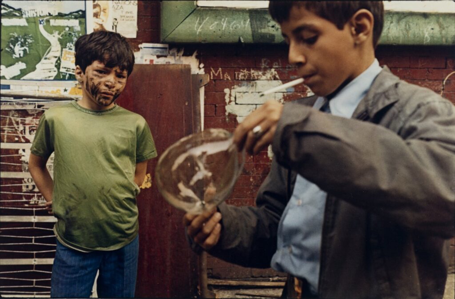 Helen Levitt (1972)
Helen Levitt was one of the first photographers to exhibit her colour work in a meaningful way. Levitt had established a career as a social documentary photographer in black and white and began using colour in 1959, but lost most of the work to a burglar a decade later. Starting again in 1971, Levitt made a series of Kodachrome slides, forty of which were shown in a continuous slide projection at MoMa in 1974. Szarkowski described the body of work as reporting “routine acts…full of grace, drama, humour, pathos and surprise”.
Szarkowski repeatedly asserted that images by little-known photographers, or commercial photographers operating in areas such as photojournalism, could as successfully explore the medium’s potential as the work of art photographers. This point of view also extended to colour photography, as he praised the work of William Eggleston as no less than the “discovery of colour photography”.
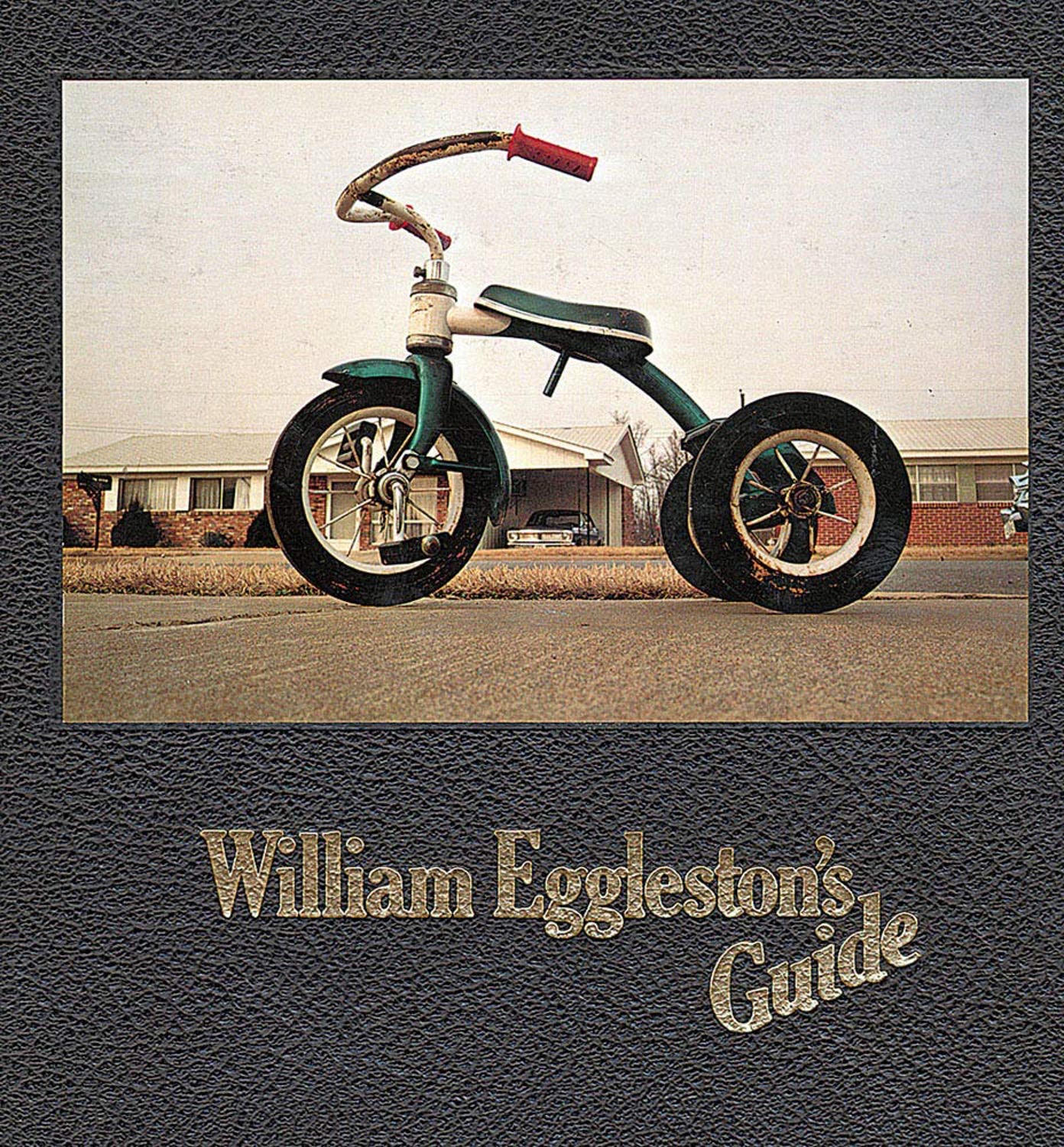 William Eggleston’s Guide (1976)
In 1976, John Szarkowski organised a landmark exhibition, Color Photographs by William Eggleston, and with the accompanying catalogue, William Eggleston’s Guide, he proclaimed the images to be “perfect: irreducible surrogates” of understated, commonplace views dealing with the social landscape of the New South.
Szarkowski presentation of Eggleston’s straightforward looking-at-the-world images was seen by many to seamlessly combine colour, content and form. Eggleston had worked with colour transparency film from 1965, then colour negative from 1967. In 1973 he began to print his images as dye-transfer prints, with well saturated colours and elevated contrast.
He had initially shown his work to Szarkowski in 1967 but despite both sides being enthusiastic about an exhibition they didn’t proceed until almost a decade later. Szarkowski, wary of how Steichen’s colour shows had landed, urged patience – it is not clear whether he felt the work needed refinement or the audience was not quite ready. Nevertheless, when the gallery opened it was immediately polarising and the negative press only served to keep the gallery in the public eye. Critics like Hilton Kramer saw his photographs as overblown, mundane and trivial snapshots that were “perfectly boring” – a retort in response to Szarkowski’s description of their “perfect composition”. Critic Gene Thornton commented it “was the most hated show of the year.” It wasn’t just the colour that offended; Harry Callahan and Helen Levitt, were respected photographers who had added colour to their kit bags in the postwar period, but their use of it was modest. This new generation made chromatic relationships key to their pictures’ formal logic, and/or they used colour to enhance the illusion that a photograph is a simple window on reality, to trenchant, often deadpan effect.
Joel Meyerowitz also began to commit more fully to colour in the early 1970s. From 1962 to 1965, he photographed the streets of NYC with Garry Winogrand, Lee Friedland and Tony Ray-Jones using a 35mm camera first with colour slide film, before reverting back to black and white. Printing colour transparencies was still a hassle at that time, however by the early 1970s colour technology had advanced to the point where you could make prints in the darkroom without the difficulties and expense experienced only a decade ago.
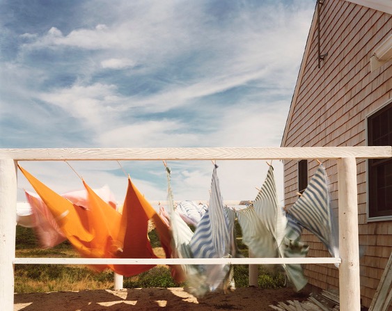 Joel Meyerowitz (1982)
Meyerowitz himself committed himself entirely to working in colour in 1973. He reasoned that if a photograph basically just describes things, then a colour photograph describes more things. He was also ready to explore other styles of photography and had invested in an 8×10 camera which slowed his style down immediately – replacing the rapid immediacy of a 35mm hand-held camera with the reflection and composition required to operate a large-format tripod camera. He began to wait for days for the perfect combination of light and colour values. His book “Cape Light” (1978) perfectly captured this considered and harmonious approach.
It was in the 1970s that photographers began to embrace the notion that colour photographs makes people and events feel more real than their black and white counterparts. Whilst some of Magnum’s earliest members – George Rodger, Werner Bischof and Eve Arnold – had worked in colour since the 1940s and early 1950s, the 1960s had been largely a decade of black and white photo-reportage. The notion that monochrome held an innate association with reality and truth, while colour photography was usually associated with superfluous fantasy and commercial extravagance had truly been overcome.
The Eggleston exhibition of 1976 may not have necessarily revolutionised the medium, however it came at a time when technology was mature and affordable enough to lower barriers to entry for many artists. This in turn allowed for the start of widespread consumer adoption and Eggleston’s eye for colour helped propel it forward. This was further supported by Ernst Haas, Jay Maisel and Pete Turner who started the Space Gallery, and the George Eastman House, Corcoran Gallery, Images Gallery, Zabriskie Gallery - all of which held serious exhibitions of colour work in the same year.